Eccentric Property Solutions manages property for investors who want more from their real estate. The company finds opportunities others miss and works to grow the value of every property it handles. The name promises something different, so the brand had to look different too. I created an identity that feels fresh and confident and still earns the trust of people handing over their investments.
The mark is a single roofline that climbs as it moves to the right. You read it as a house and as a line on a rising chart, so it ties property to growth in one shape. A small four pane window sits under the roof and grounds the mark in real homes. I set the name in wide, open capitals with generous spacing, so it feels modern and reads cleanly at any size. A teal and slate gray palette gives Eccentric a look of its own in a field crowded with navy and red.
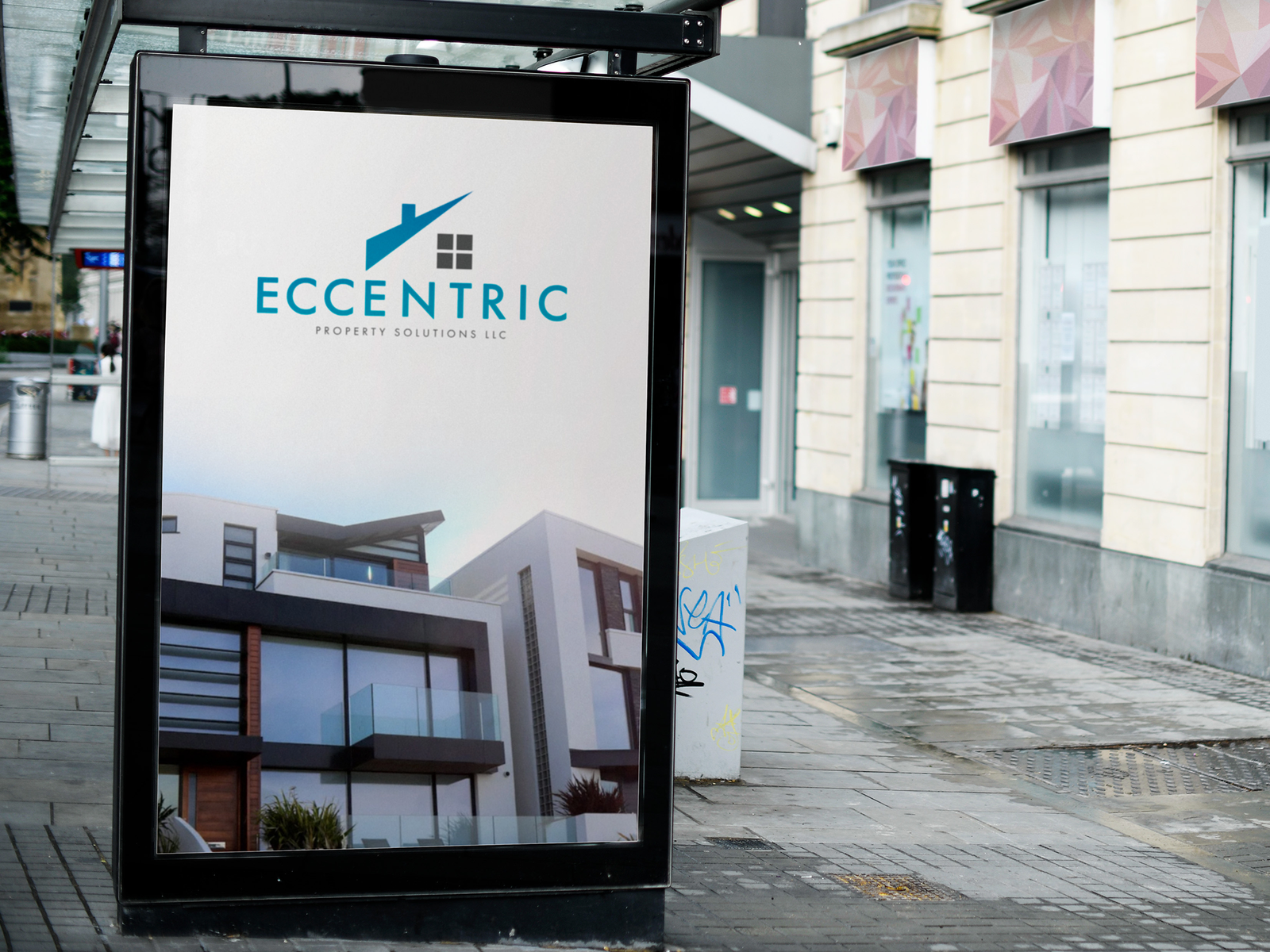
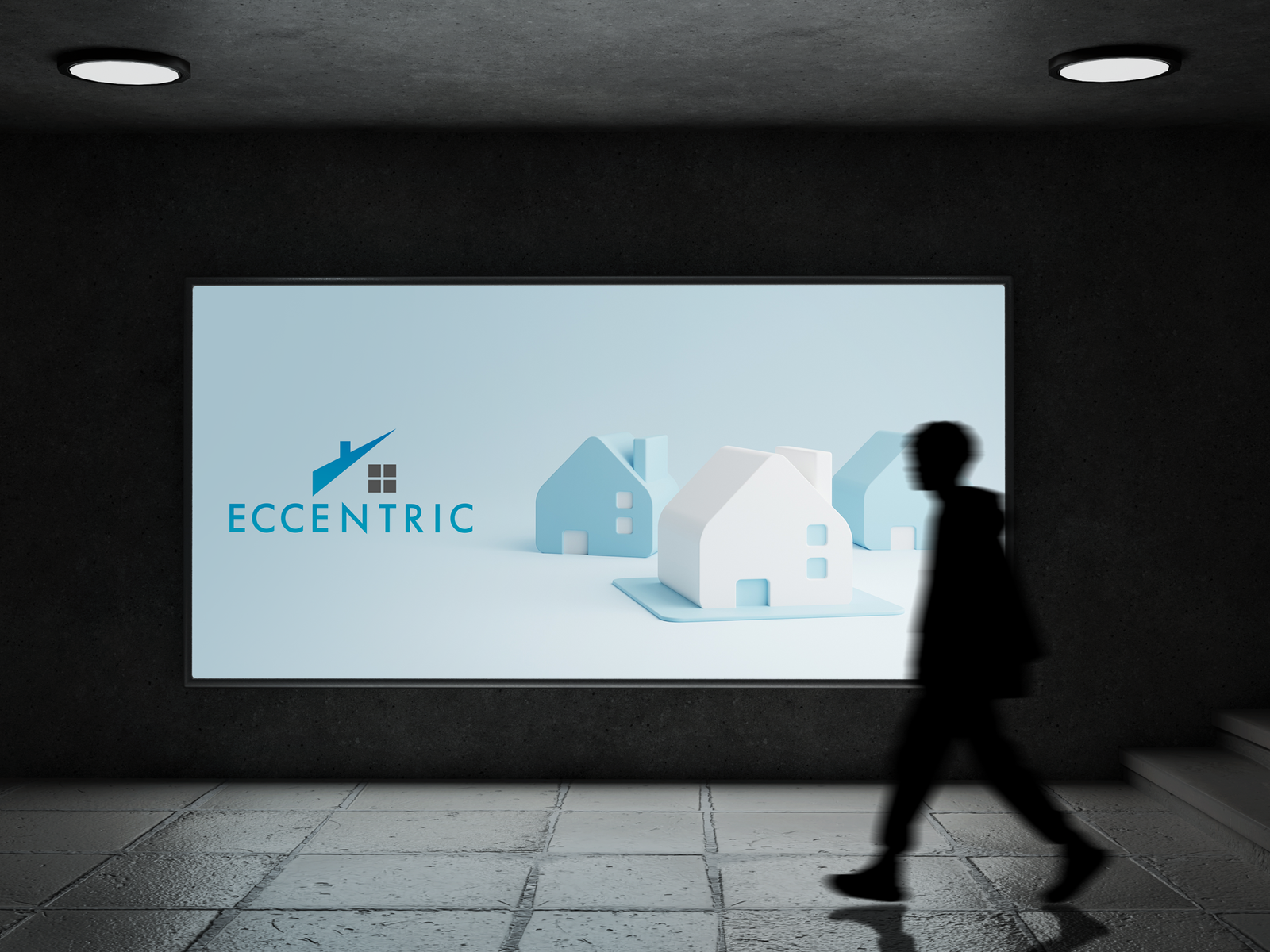
I built the logo in six versions, from full color to all black to reversed white on teal. With that range, you can place the mark on white paper, dark photos, or a bright color and never lose contrast. From there I carried the system onto business cards, stationery, a mounted wall sign, a bus shelter poster, and a billboard. The cards split teal and gray across the front and back and keep the contact details simple. Every piece follows the same color and type rules, so the brand looks like one company from a handshake to a street ad.