projects
project
teflon protection
Teflon Protection Group started out offering personal security. When the company moved into commercial security, its old look no longer fit the clients it wanted to win. Business owners and property managers need to see a firm they can trust with their people and their buildings. I built a new identity that tells those clients one thing fast. This team takes protection seriously.
Client: Teflon Protection Group
Project type: Brand Identity
Year: 2025
Category: Branding

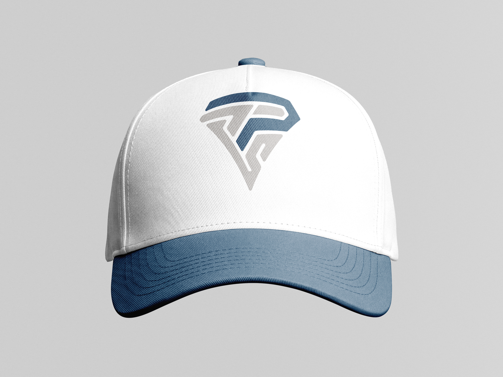
The mark joins a T and a P into one shape. Together they form a shield that narrows to a point, a direct nod to protection. A deep navy stroke wraps over a steel gray base, so the two letters read as layers of defense. I paired the mark with a heavy, wide wordmark that stays readable from across a parking lot. The result feels strong and steady, which is what you want from a security partner.

A security brand lives in the field, so the logo has to work everywhere your team shows up. I built a full color version in navy and gray and a black and gray version for high contrast uses like embroidery. From there I applied the system to business cards, a structured cap, a polo, a tactical vest, and a fleet van. Every piece uses the same mark and type, so a guard at the door and a van in the lot look like one company. Teflon now has an identity ready for commercial bids, uniforms, and vehicles.