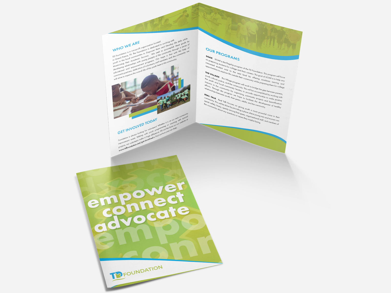
The TD Foundation is a nonprofit that creates educational opportunities for underprivileged youth and helps them reach their goals. The foundation wanted to stand out in a crowded nonprofit space and connect with two groups at once, the young people it serves and the supporters who fund the work. That called for a brand that feels hopeful, warm, and easy to trust. I worked closely with the foundation’s team to learn their mission and build an identity around it.
The foundation’s tagline is Empower, Connect, Advocate, and the logo puts those ideas into one shape. The D in TD is a puzzle piece that locks into the T. It shows how the foundation connects young people with the support they need. A green swoosh rises under the letters and points to growth. Bright sky blue and fresh green keep the mark upbeat and youthful. Clean, rounded type makes the name easy to read and feels friendly to students and donors alike.
I set the tagline in spaced capitals beneath the name, so the mission travels with the logo everywhere it appears. From there I designed the business cards. The front carries the logo and contact details on a clean white background. The back flips to a bold green pattern with Empower, Connect, Advocate stacked in white type, so the mission is the first thing people see when they turn the card over. The colors, type, and puzzle piece mark give the foundation one consistent look for outreach, events, and fundraising.